
Your gain: Learn about how the colors of the Losses Become Gains brand came to fruition, and my inspiration behind the colors I decided to use. The goal here is to not only give you a glimpse behind the brand and share the intentionality with you, but also inspire you to harness the things, places, or people you love into something beautiful that you can use to create something amazing.
The Vibe
When I first came up with Losses Become Gains, given I work in digital marketing, I put that digital marketing hat on and thought about how I wanted this whole idea—this whole entity, brand, and community—to look like. How did I want people to feel when they visited my website? When they saw the colors I associate with it, what is that going to elicit in people? Did it flow with the message I’m trying to portray through my work? Is it excitement and hope? Calm and relaxed?
Well, I wanted all of those things, honestly! With grief, so much of what we’re trying to seek out is some semblance of calm and serenity again after the chaos and sadness of losing someone or something significant. For me, that meant tones that speak to this. A relaxing green or blue that isn’t too “in your face”. A darker hue that has some richness and impact but tranquility, perhaps a hint of power… if you will.
But also some hint of joy and brightness, right? Because we want to find our gains here! We want to find glimpses of happiness, vibrancy, and uplifting feelings that will carry us through our grief day-to-day.
The Inspiration
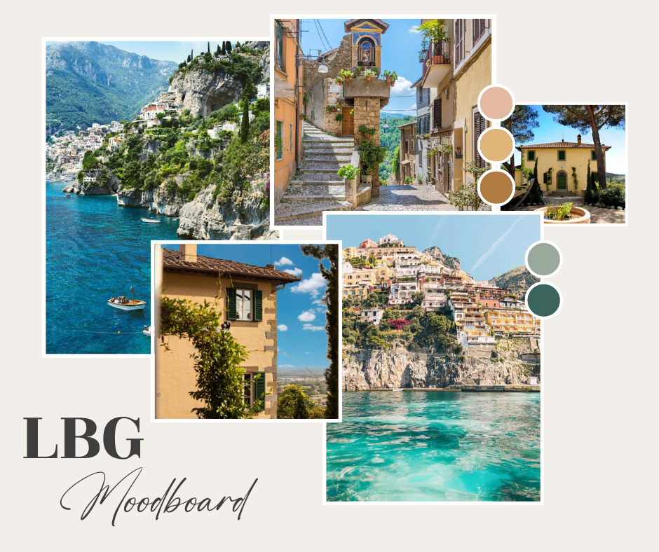
I’m SO excited to share this mood board with you! When I tell you that everything I do with Losses Become Gains is intentional, I’m not kidding. I didn’t want to just choose some random colors I like to look at and call it a day.
In order to find the exact colors that would speak to me to create this whole shindig, I closed my eyes and thought about what inspires me. If something or some place inspires me and speaks to my soul, there will never be any regret from taking hues and creativity from that.
The Comforting Warm Tones
For me, so much happiness and inspiration lies within Italy. The warmth of so many homes and structures in that country just makes me want to hug them tightly. They almost warm your skin as you walk among them, in a sense. This is where the yellow (a very Tuscan or honey yellow, rather) in my logo and much of my content comes from. I accented this with a warm, soft pink you often see in the architecture, and also a rich burnt orange for good measure.
The Invigorating Cool Tones
These warm tones are contrasted with the insanely beautiful, vibrant blues and greens you get from the sea. It’s calming, but elicits feelings of something bountiful and expansive you just want to dive into—at least in my mind.
The water and ocean has always been a draw for me, though. I gain a lot of energy from the ocean, but particularly that of the Italian coast. It just calls to me, I can’t explain it. It’s where I get a lot of ideas, find extreme comfort and harmony, and really it’s just my happy place. So are the hills of Tuscany, but that’s another story.
Finding The Colors
So, to finish up this quick post today, that’s really where the colors come in! I took to Pinterest to look for photos of Italy that resonated with me. I took pieces of each of the photos above, used the dropper tool in Photoshop to carefully and intentionally find ones that resonated with me, and what you see above became the colors of Losses Become Gains.
If you didn’t know this about me already, everything I do and put out into the world is very purposeful and thoughtful. I want everything here to be a representation of what you can find here at Losses Become Gains, and I hope so deeply that you can feel the love and thought put into it.
Every email, if you’re on my mailing list. Every blog post, every post on Instagram, and certainly my website. Everything that makes Losses Become Gains not only “me”, but something I truly hope you resonate with.
Challenge Your Creativity
As always, I challenge you to be fearless in taking a few moments to breathe and think about what makes you happy. That’s what I did when forming this community, blog and brand, and I want for you to do that for yourself here. What speaks to you? What sparks joy? What colors make you happy? What places? People? Things? Activities?
I challenge you to tap into that not only today, but every day. How can you incorporate the things you love most—the things that most resonate with you—into your life more? Give that some thought each and every day.
Get Your Freebie From Me
I have THREE free tools you can take advantage of if you’re ready to step up your grief work. I’m so excited to share these with you! My Gratitude in Grief Journal Prompt, From Grief to Grinning Toolkit, and A Practice in Presence Toolkit are ready and waiting for you to download, all you have to do is click here or the button below.

View comments
+ Leave a comment